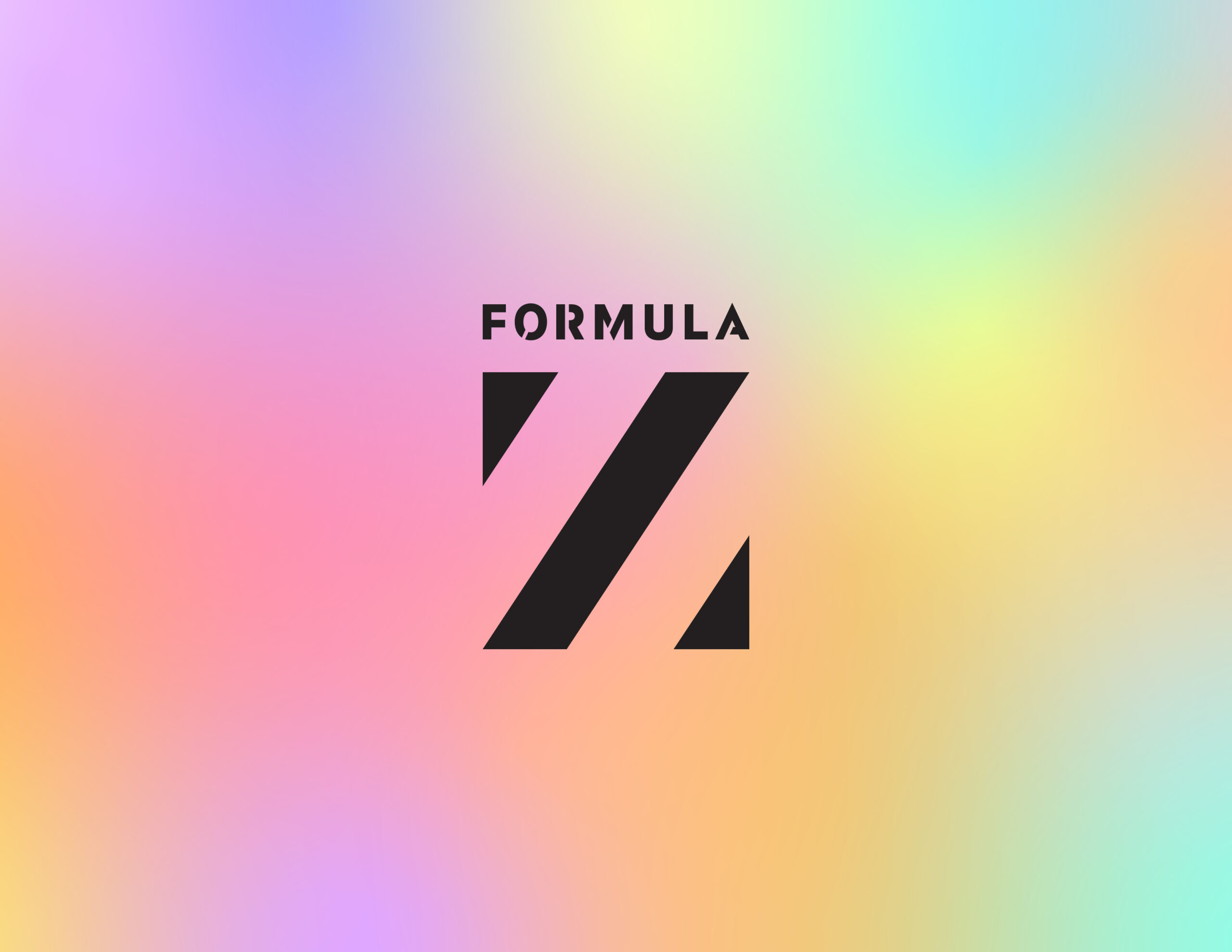
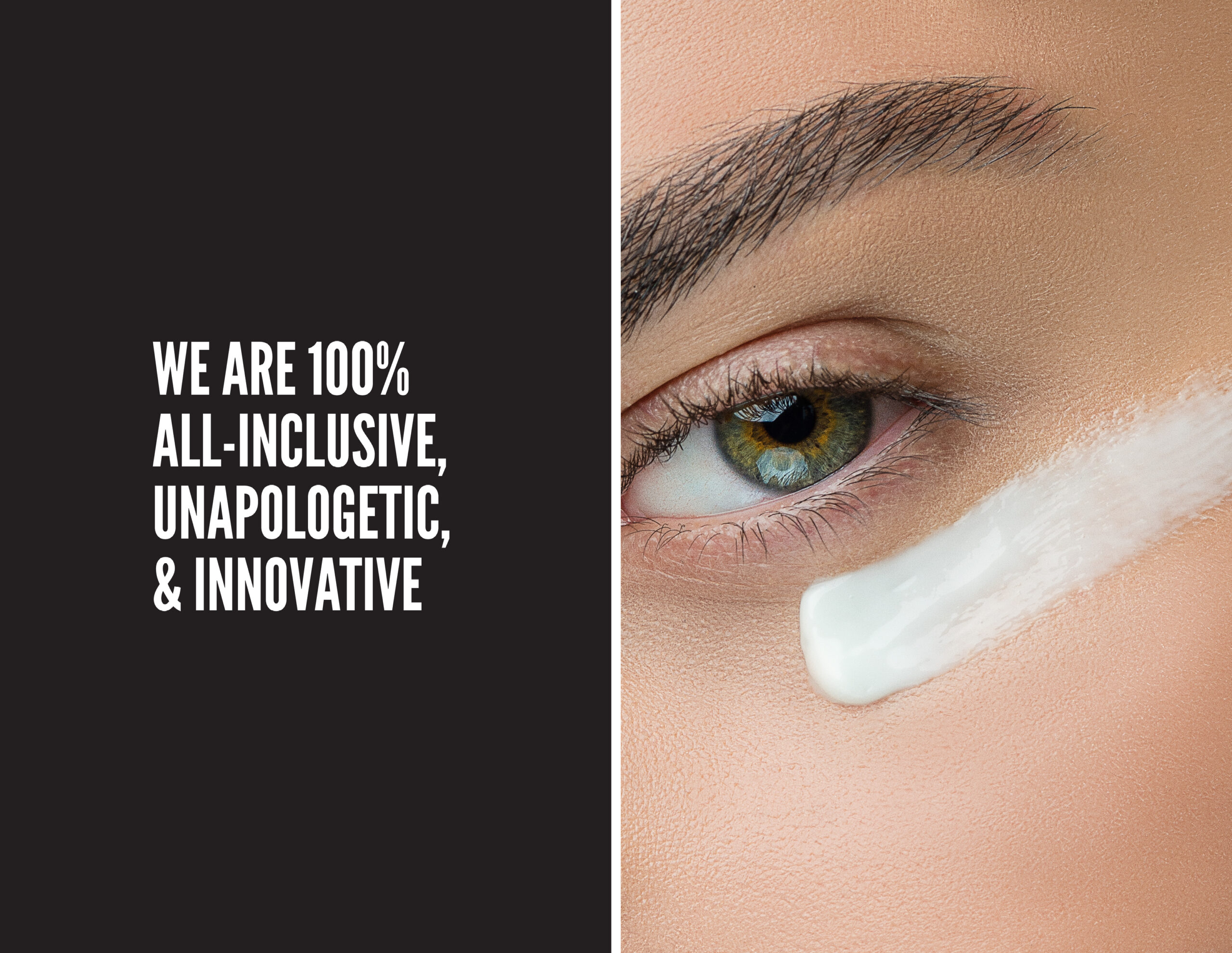
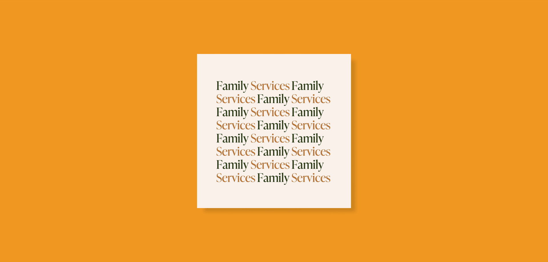
Formula Z was founded by teen makeup artist and entrepreneur Zach Dishinger. The brand aims to lead the gender-free beauty space with authenticity, individualism, and self-expression.
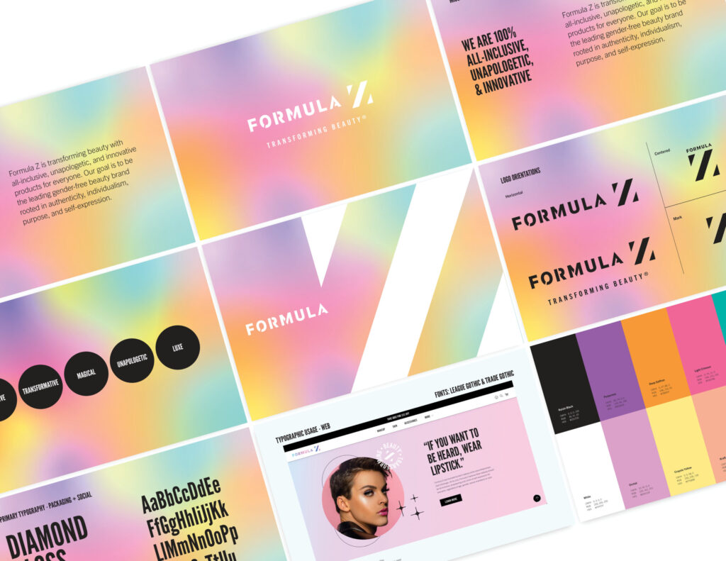
To help them achieve this, I partnered with Formula Z to refresh their visual and verbal identity. We carefully analyzed their brand assets and crafted a stronger, more unified look. At the same time, we ensured the brand remains adaptable for future growth.
At its core, Formula Z believes that makeup is a form of self-expression for everyone. Feeling beautiful is a human experience—one that transcends gender, skin color, or who you love.
Through our collaboration, we defined their mission, positioning, and tone. We also established clear guidelines for typography and headlines. All of this was distilled into a comprehensive 24-page brand guide.
What I did : Graphic Design, Verbal Identity, Branding
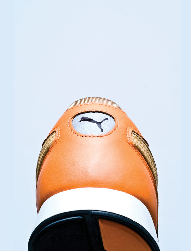
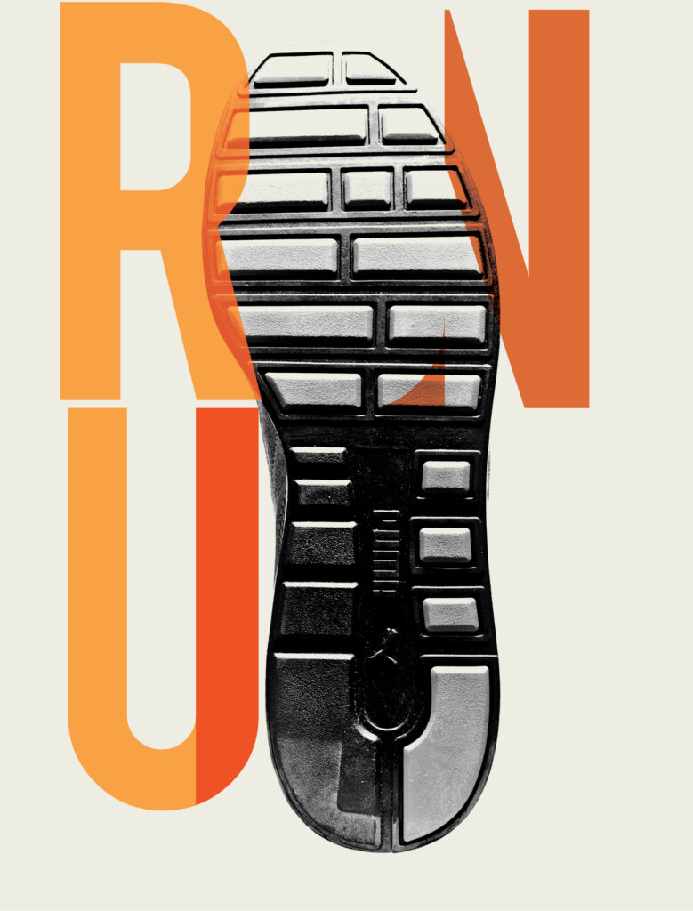
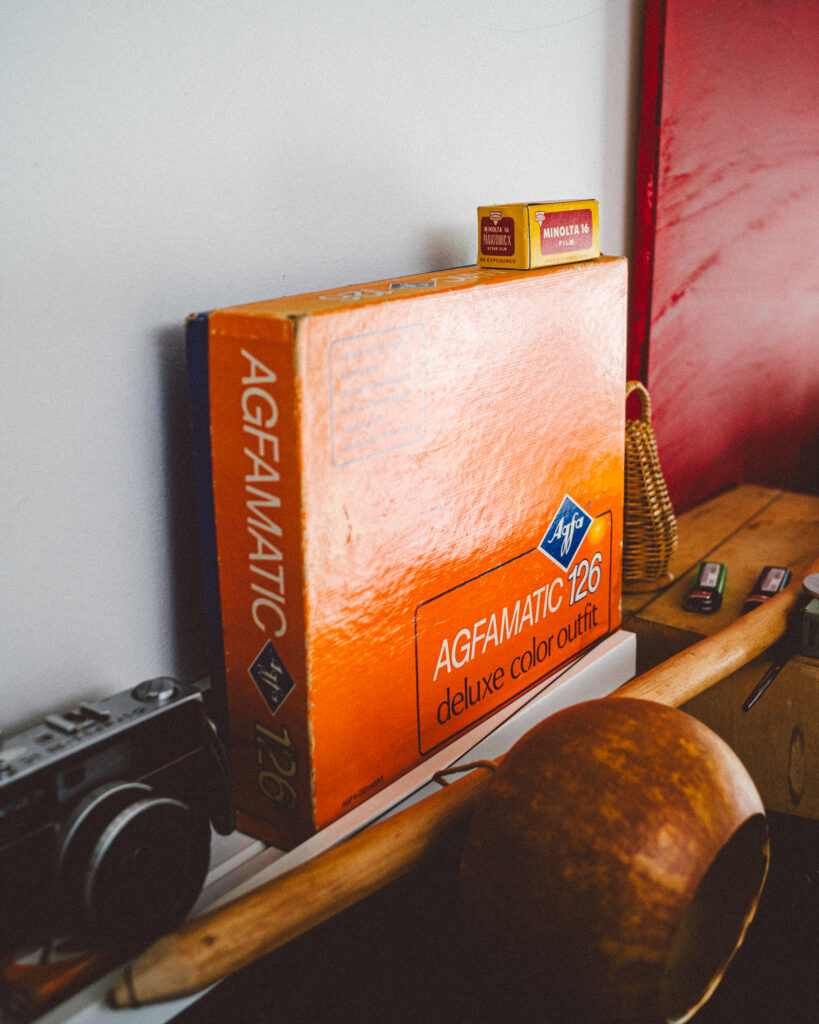
Hmm, I picked my personal brand colors way back. Looking at my past work, I see clearly my preferences for yellows and oranges as they made their way into my portfolio work. The takeaway…we are subconciously guided by patterns, whether behaviorial or vectorial.
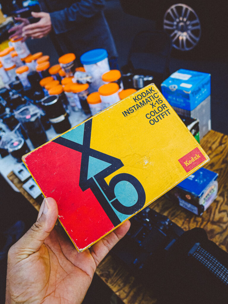
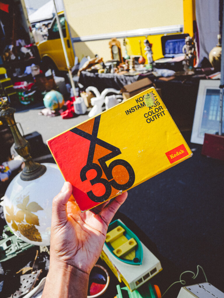
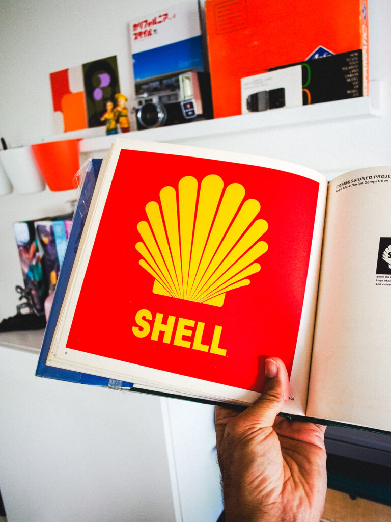
The simplest design is oftentimes the best. Although they stumbled as a business, Kodak definitely succeeded as a brand. The easily recognizable colors and logo conjure up warm feelings of nostalgia across the world. Think of Canon and Nikon and you might think “professional”. Now think of Kodak. I imagine “fun, film, photo labs, joy, sharing, anticipation, excitement”.
Despite essentially withdrawing from the camera market, there are enough advocates for Kodak to continually shape its perception as a brand. And that right there is the power of branding.
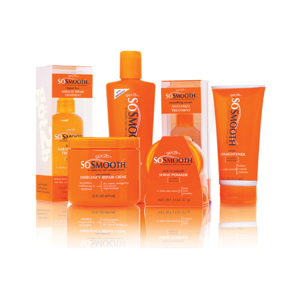
Developed in 2002, this was my first opportunity to design a line from the ground up. Before this, my title was production artist. Designs were sourced through outside agencies but being in-house, I felt that if given a chance I could design better packaging options. My very supportive marketing director and art director gave me an opportunity and that began my twenty-year career in this industry. Immediately I was promoted to a graphic designer! I have no problem asking for a chance. It can lead to great things.
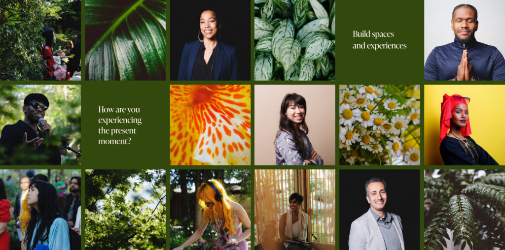
Founded by Ethiopian-born refugees Owliya Dima and her daughter Meymuna Hussein-Cattan, the Tiyya Foundation is dedicated to celebrating pride, joy, and cultural expression through culinary arts, music, storytelling, and more.
Tiyya’s goal is to create an inclusive space for refugees and undocumented immigrants, offering dignity and recognizing the value they bring to our communities while cherishing the diverse cultures they represent.
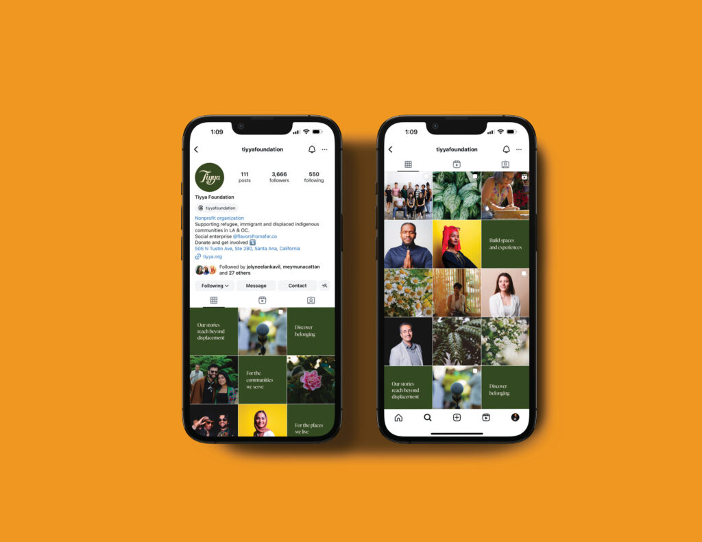
Partnering together, we delved into strengthening Tiyya’s visual and verbal identity to better serve their community of clients and supporters. By honing in on their messaging, we sought to engage their audience with an optimistic expression as opposed to the often negative portrayal of the immigrant experience.
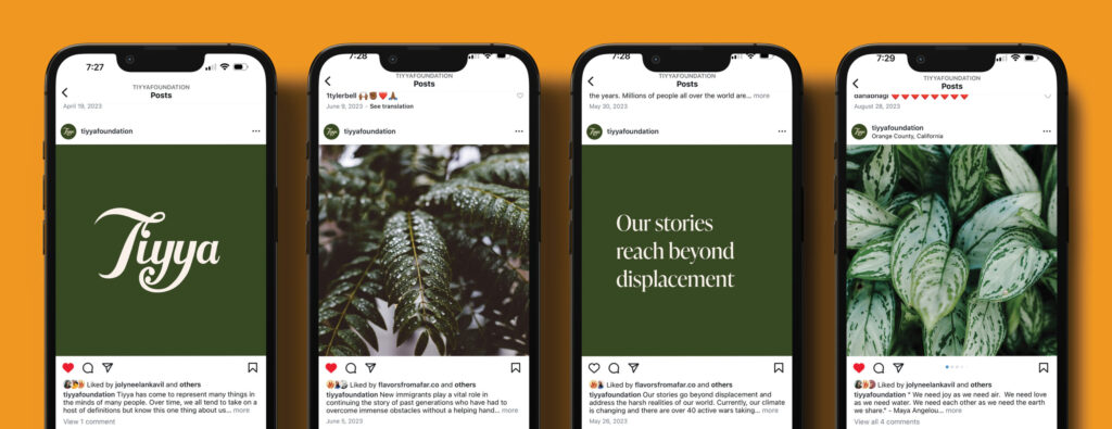
We developed content writing and social media assets to enhance their online presence. Focused on building and maintaining a strong and vibrant community, macro images of flowers and botanicals were placed after portraits to emphasize a sense of togetherness and cooperation that is essential for cultivating a healthy community.
What I did : Graphic Design, Verbal Identity, Content Writing, and Photography
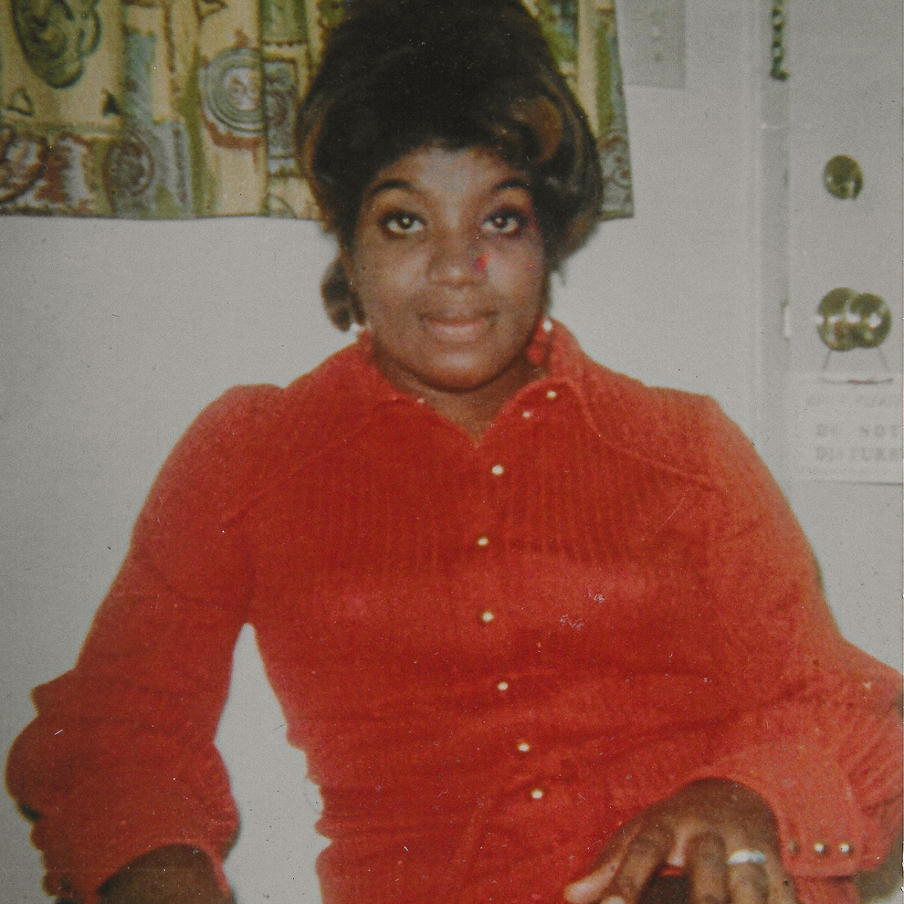
My interest in design was sparked by my family’s nostalgic Kodak and Polaroid family albums, Stevie Wonder record album covers, and the color Orange.
Specifically that distinct shade of burnt orange that was widely applied in the 70s to velvet couches, kitchenware, clothes, wallpaper, and rotary phones. As a child, I would love to spend hours sitting on the floor, meticulously scanning the pages of our family album. It was filled top to bottom, right side up, and even sideways with beautiful and most times blurry instant prints that captured nothing but happiness. And since these pics were from the decade of the 70’s, I got to see my mom’s look transform from something like the Supremes to London Mod-Squad, and from Black Power to shiny disco.
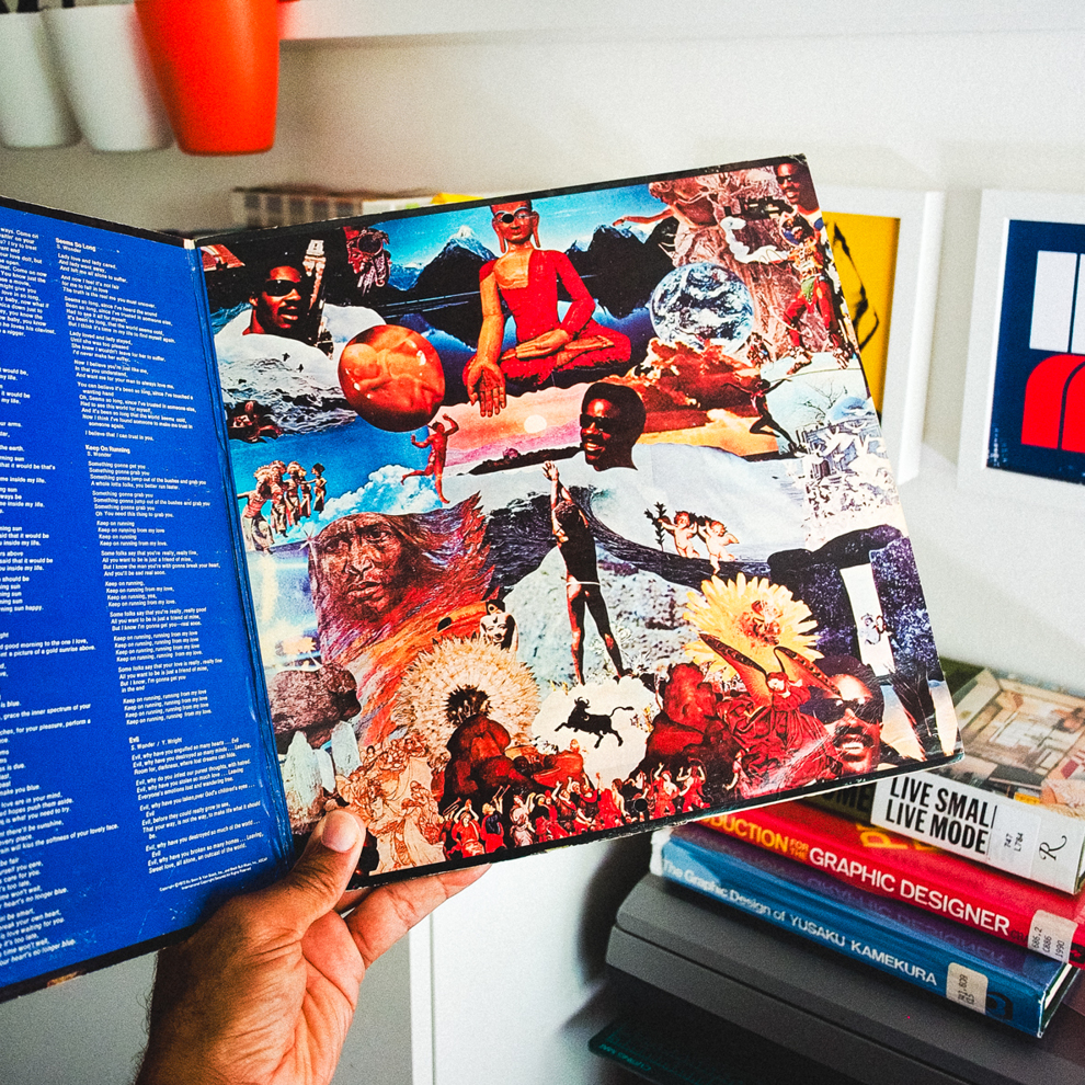
Our kitchen counters were stacked with orange, brown, and avocado-colored Pyrex bowls and Tupperware containers screen printed with the most unique geometric patterns. Sometimes they were decorated with yellow florals, and other times red roosters. I’d watch my mom season and flour chicken in those. In each room of our house were vinyl records spread across the carpet wall to wall. They kind of record covers that folded out into three or four panels, filled with incredible images that blended bold typography and design with unique compositional layouts.
Despite not knowing what graphic design was, I had an understanding that someone made that. Someone unique, possessing a skill I didn’t have.
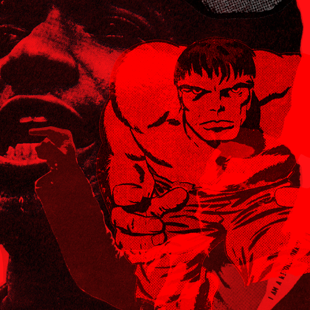
When I was five years old, my oldest brother Daryl, who was 13 years older, gave me a stack of Marvel and DC comics to start to journey into the unknown, as Stan Lee would put it. I had my library comprised of volume issues of X-Men, the Micronauts, Incredible Hulk, the Avengers, Rom the Space Knight, Conan The Barbarian, Ghost Rider, Warlord, Amethyst, and Heavy Metal.
And while I vividly remember all of the intricate and interwoven storylines, I also remember printing inconsistencies and dot patterns.
A lot of times the color would bleed over the character lines. Or that the paper stock would yellowed, altering the look of the Hulk, for example, from one page to the next. With closer inspection, I noticed that there overlapping colored dots, easy to spot on the paper used on the inside pages of the comic books, but not so much on the glossier cover paper. Then I examined the printing of Steve Wonder’s “Music Of My Mind”, and Parliament’s “Mothership Connection”, printed on what looked to me like cardboard-colored paper, and I knew I stumbled upon something, but not enough to know the term “graphic design”. But I did know that somebody with a wild imagination had made all of that. That observation, curiosity, and need to make something is what led me to become a designer myself.
If you know what’s up, then you’re cool too. I used to create screen-printed logos of Freestyle Fellowship and the Hieroglyphics onto tshirts for myself and my friends in high-school. Years later and I’m still representing 93 till infinity through design and dance.
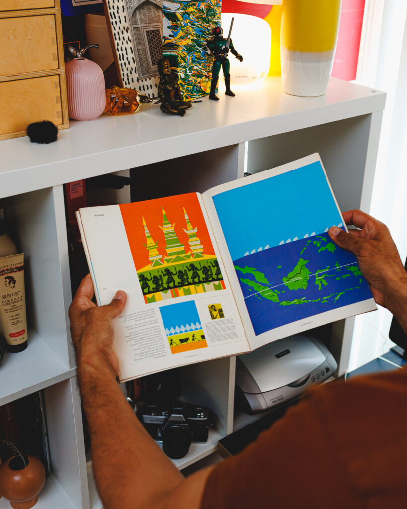
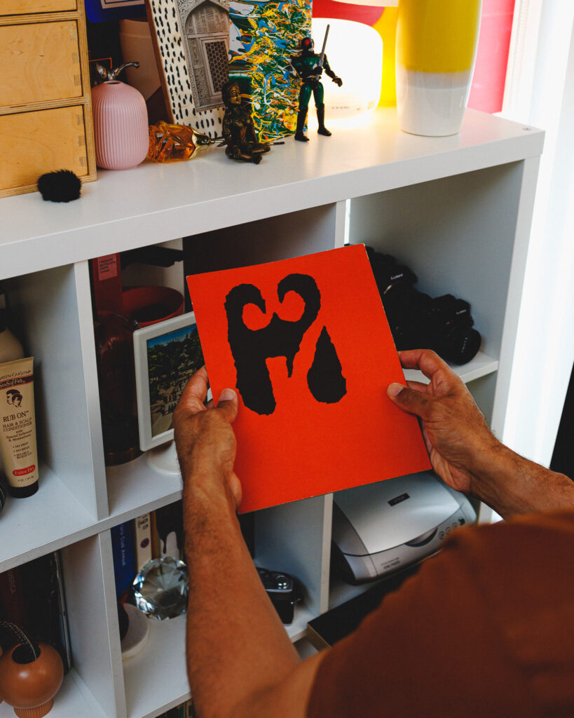
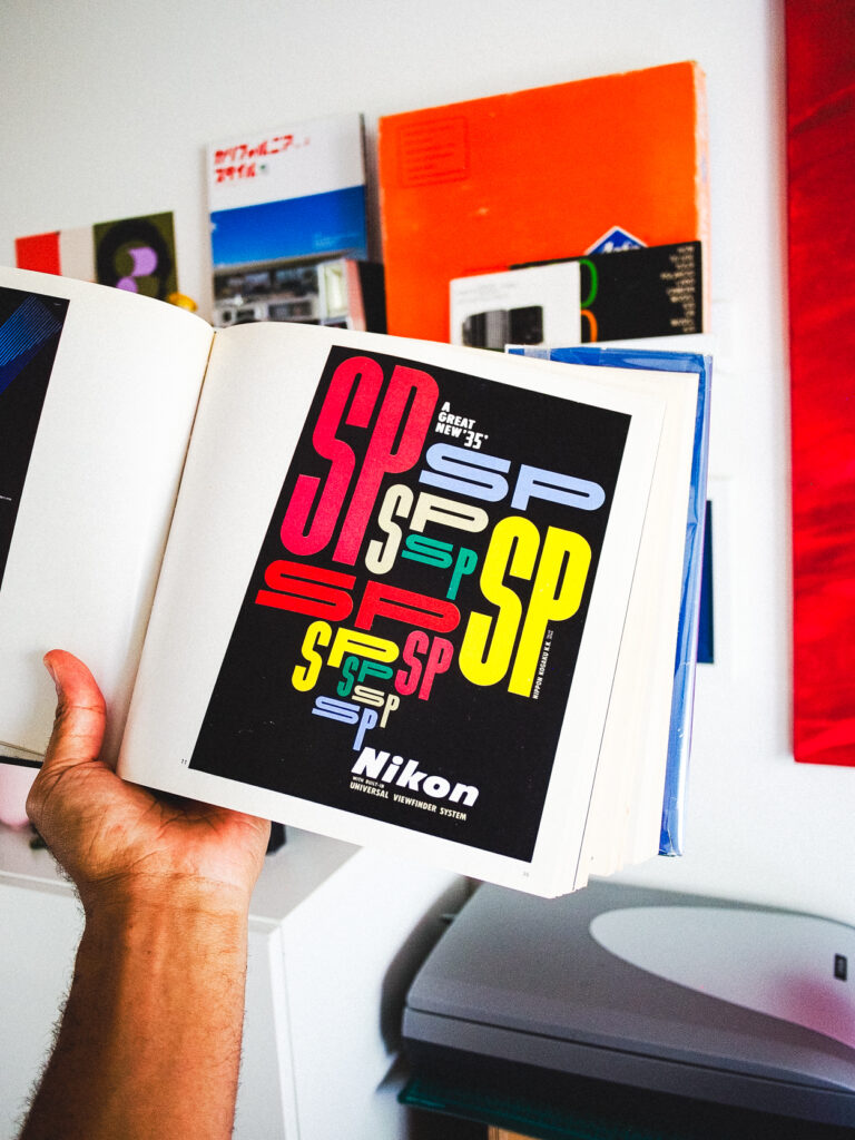
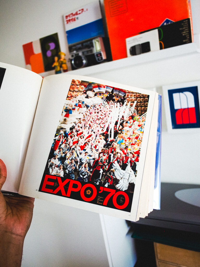
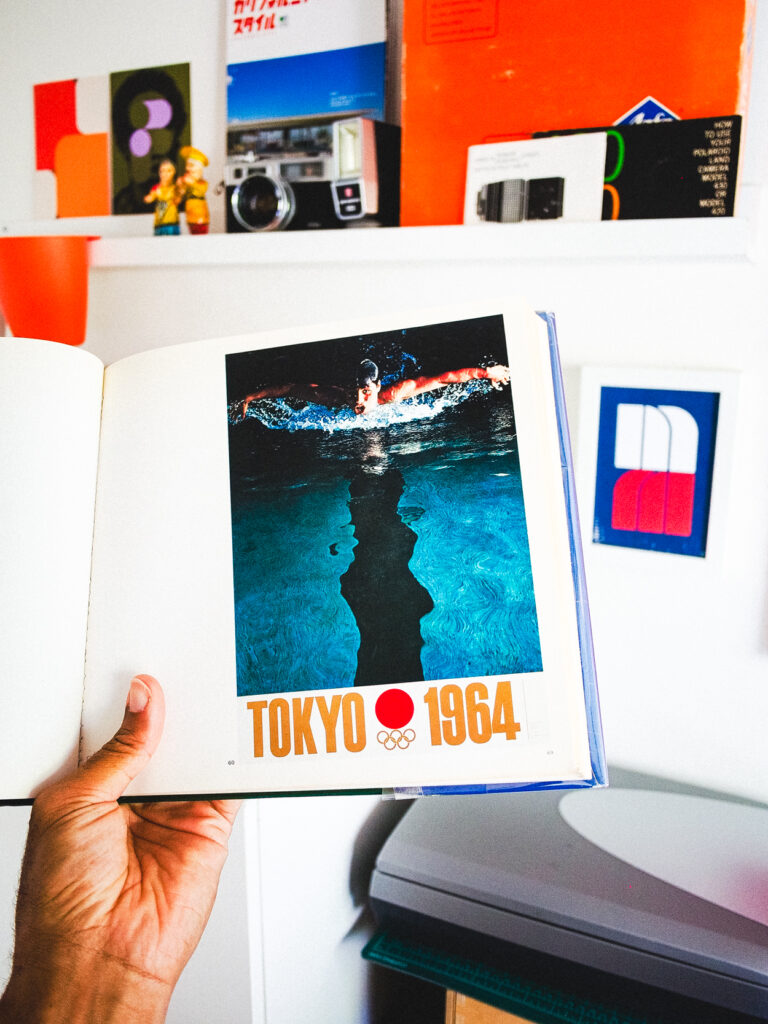
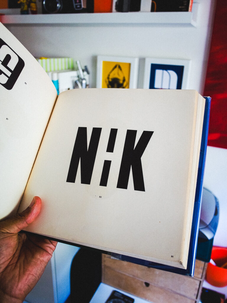
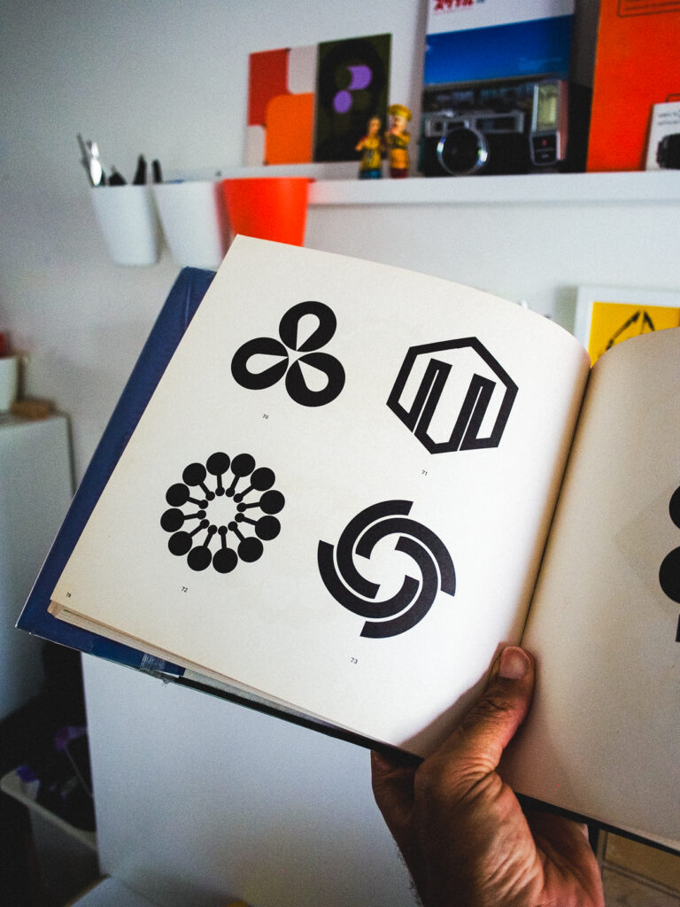
Out of print but thanks to my local library I get to check out his spectacular work as often as I like. The Expo’70 graphics are my favorite. Can you imagine what Tokyo must have been like leading up to the world’s expo? That period in time is immortalized through logo marks and wayfarer signage that is referenced today as the standard to design by.
As I have aged I am being presented with the challenge of making my work known to younger brands. The last four years have been challenging but I’ve been fortunate to have a network of friends and family who have supported me in the last twenty. Being more vocal and opening up has sparked more of an interest in what I do as well as presenting opportunities for growth.
If you have the time, check out this interview with Shoutout LA.